Ugly Design

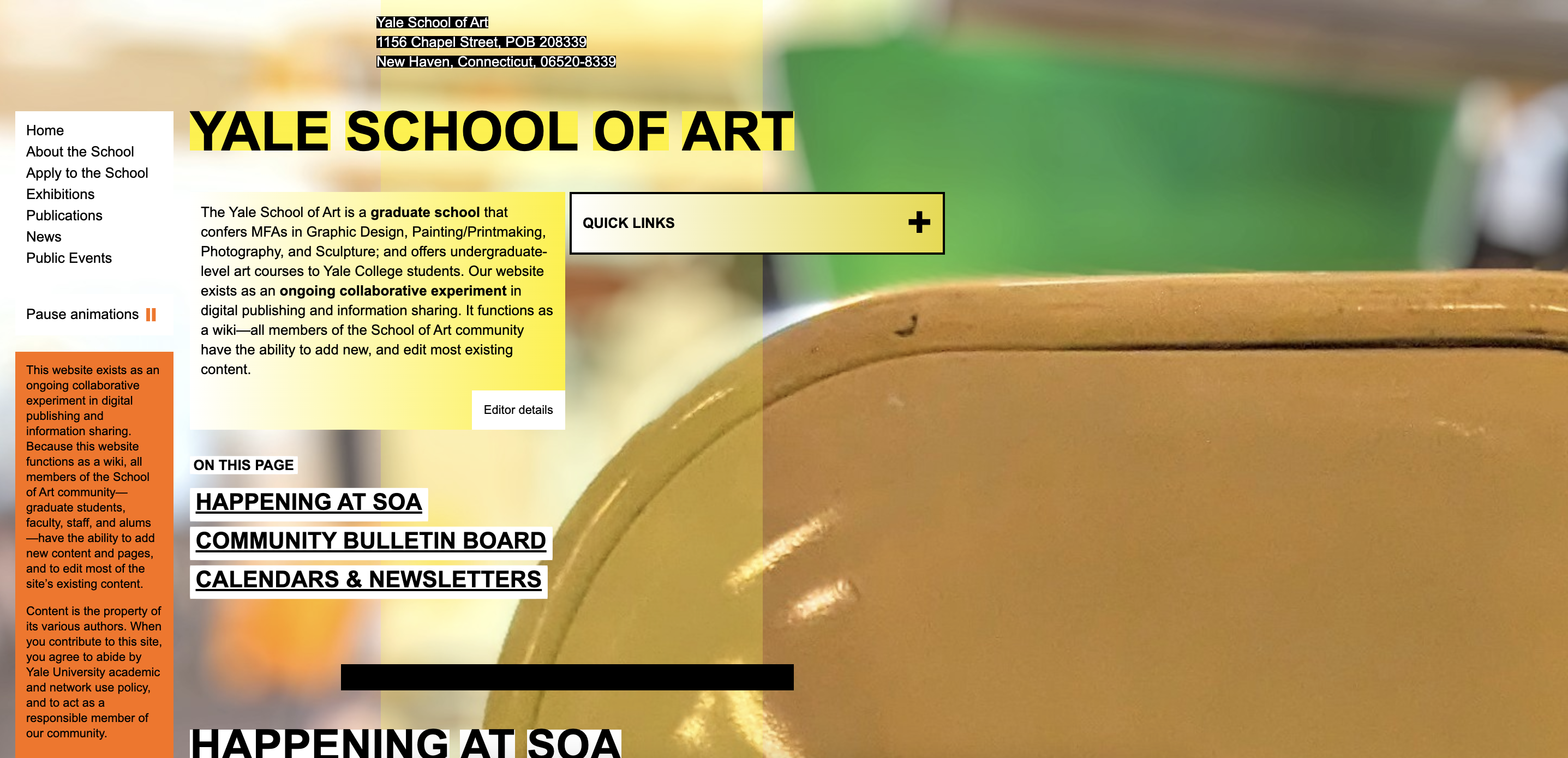
I have a feeling someone will bring this up if we talk about "ugly design": Yale School of Art’s website. Some people appreciate the aesthetic, and I am one of those people. However, I initially hated the design. I thought it was an old default website template, and once I realized it was very intentional, it seemed like they were trolling or speaking in some exclusionary, secret language, or maybe “self-indulgent.” One of the more common criticisms about the website is its tendency to exclude; if you don’t understand the language of the website, then you don’t speak the language of the program (thus, you won’t fit in). And us “conventionally-minded” people hate it, as Bierut puts it. This isn’t really an issue for me because in a lot of ways, I feel excluded from the some of the more mainstream design languages (e.g. Swiss minimalism), but that doesn’t mean I can’t appreciate it. In Vietnamese, there is a phrase that roughly translates to “do you know how to eat this?” as opposed to “do you like to eat this?” This approach has allowed me to appreciate all forms of design and even learn to love them.
And speaking of intention, I don’t think it’s easy to make ugly design that looks good. Bierut said, “At all costs, however, onlookers should be reassured that the results, no matter how careless-looking, were achieved through the same painstaking attention to detail that one would associate with more conventional solutions.” Although I initially perceived Yale’s website as a default template, it’s a lot more obvious to me now to understand that every part of it is absolutely intentional. The second article from Eye Magazine also references this intention when mentioning the Cranbrook students who “gave themselves the warts” when designing Output, as well as talking about Ralph Waldo Emerson ("design is only ugly when devoid of aesthetic or conceptual forethought"). That restaurant menu shown during Lucy Hitchcock’s lecture with Ramon’s class comes to mind–it’s “ugly,” but there’s a concept behind it. However, there is always a risk of “ugly design” turning into a “style.”
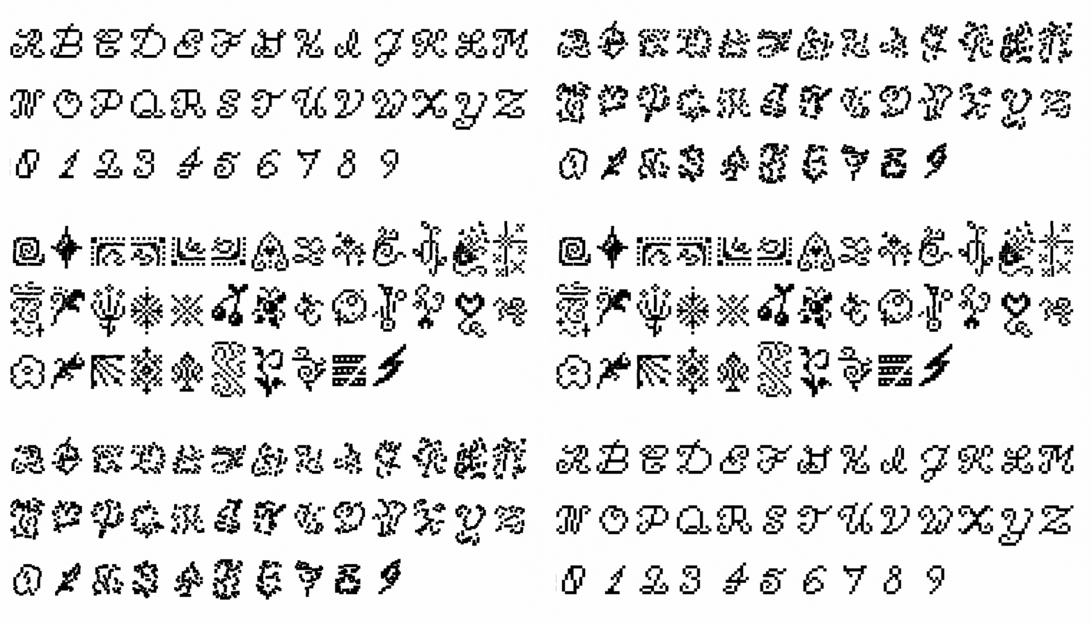
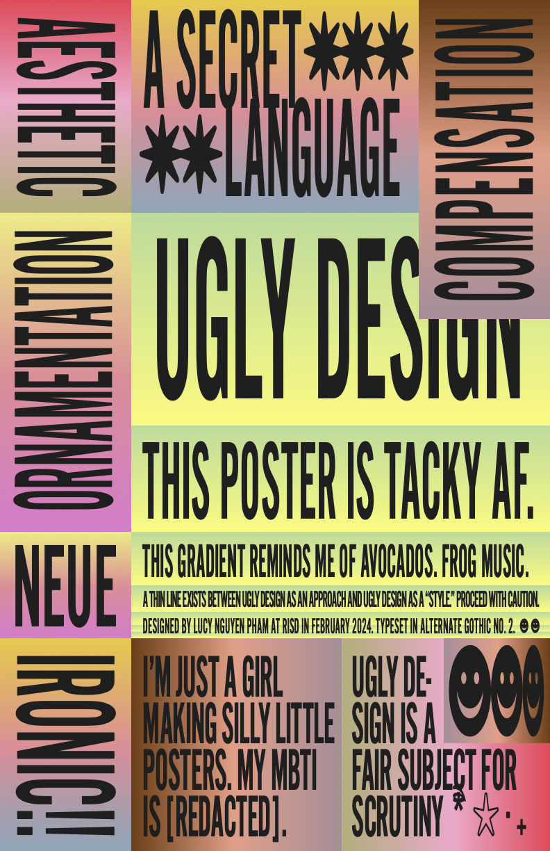
One quote I really appreciate from the Eye Magazine article is this: “The value of design experiments should not of course be measured only by what succeeds, since failures are often steps towards new discoveries.” As a student, budding designer, and a mild control freak, I think “ugly design” is an opportunity to experiment with design. The Folk Art Zine I created last semester was extremely ornamental–so ornamental to the point that it considered be “tacky.” The Eye Magazine article mentions Lorraine Wild’s essay in which she examines Edward Fella’s work, as well as the excessiveness of things like ornamental dingbats. I recently created a pixel ornamental typeface that references ornamental glyph fonts to celebrate ornamentation. Some semblance of ornamentation is coming back in style (in the form of “girl design”).

Another aspect of Yale’s website that I love is that it does communicate something about its program in a way that I think a lot of other art and design schools do not. I think some people see this lack of neutrality and assume that Yale only likes a certain kind of design style or aesthetic which makes it exclusionary, but I don’t necessarily think that’s true. The Eye Magazine article describes how Output Magazine was distributed not just to the Cranbrook community but to thousands of AIGA designers: “rather than remain cloistered and protected from criticism as on-campus ‘research’, it is a fair subject for scrutiny.” In comparison, other schools are very marketable, but it also feels pretty neutral and the outcomes or ethos of the program is somewhat protected from public scrutiny. For instance, the RISD Graphic Design page on the main website is very much aimed at prospective students, but the department website is no where to be found (which is less neutral than the main website).
I think most of the activities and research of the RISD GD department is hidden from public view whereas Yale students have the ability to edit the website, making it a more community-centered platform. And, current and past students have landing pages on the Yale website where they can provide links to their online profiles, bios, etc., making Yale GD’s research ever so slightly more accessible if you’re willing to make a Google search for every name listed on the website. With all that being said, I think our Instagram @risd_gd and RISD’s Digital Commons with an online thesis collection achieves something similar. Wild argues that graduate programs are suitable spaces for this kind of research. I just wonder if schools are doing a great job at making this research more accessible for scrutiny and/or influence. This kind of research becomes more challenging to do in post-grad life in a client-based industry. It’s something art schools have to consider when repositioning themselves in a climate where more and more people are beginning to doubt the value of higher education.
